Ever seen a button on a website and felt an almost magnetic pull to click it? That little prompt is a call to action, or CTA, and it’s one of the most powerful tools in digital marketing.
A CTA is simply an instruction designed to get an immediate response from the person visiting your site. It’s usually a short, punchy command like ‘Get Started’ or ‘Download Now’, presented as a button or a link. Think of it as the crucial bridge that turns a passive visitor into an active participant.
What Is a Call to Action, Really?

Imagine you’re in a store, and just as you're wondering what to do next, a helpful clerk points you in the right direction. That's exactly what a CTA does in the digital world. It shows up at the perfect moment to give clear, simple guidance.
Without a CTA, your audience is left hanging. No matter how incredible your content is, it won’t produce a measurable result if you don’t tell people what to do next. A CTA is the final nudge that moves someone from just looking to taking a meaningful step.
The Real Job of a CTA
At its heart, a call to action has one main job: to guide users toward a conversion. Now, "conversion" doesn't always mean a sale. It can be any action you want someone to take.
- Growing Your List: This is about lead generation. A CTA might ask someone to download a free guide or sign up for a webinar in exchange for their email.
- Making a Sale: In e-commerce, this is the classic "Add to Cart" or "Buy Now" button that moves a customer through the checkout process.
- Boosting Engagement: It could be as simple as asking readers to "Leave a Comment" or "Share This Post" to get more eyes on your content.
The impact of a well-crafted CTA is massive. While the average website conversion rate hovers around 2.4%, a powerful, clear CTA can push that figure above 11.5%. Even tiny tweaks matter—just getting specific with your wording can boost conversions by a staggering 161%. That's how much clarity can drive results. (You can dig into more stats on this over at Sender.net).
A great call to action does more than just ask for a click. It communicates value. It answers the user’s silent question, "What’s in it for me?" by promising a clear benefit is waiting on the other side.
Every CTA, big or small, has a few key ingredients that make it work. Let's break them down.
The Core Components of an Effective CTA
This table sums up the essential elements that make a call to action compelling and successful.
| Component | Purpose | Example |
|---|---|---|
| Action-Oriented Verb | Tells the user exactly what to do. | Download, Subscribe, Get, Start |
| Clear Value Proposition | Explains the benefit of taking the action. | "Get Your Free E-book" |
| Sense of Urgency | Encourages immediate action. | "Shop the Sale—Ends Tonight!" |
| Visual Prominence | Makes the CTA stand out on the page. | A bright, contrasting button color. |
| Strategic Placement | Puts the CTA where users are most likely to act. | At the end of a blog post or pricing page. |
Getting these components right turns a simple button into the engine that drives your conversions, giving users the gentle push they need to move forward.
The Psychology Behind a Great CTA
A powerful call to action does more than just ask you to click something. It taps into some pretty fundamental parts of human nature. The best CTAs don’t feel like a command at all; they feel like the natural, obvious next step. They work by triggering predictable mental shortcuts that guide our decisions.
One of the most effective triggers is urgency. We’re wired to act when we feel like we might miss out. This is all about the fear of missing out (FOMO)—a powerful motivator that gets people to jump on an opportunity before it vanishes.
Scarcity plays on the exact same instinct. When something is presented as limited, its perceived value shoots up. Think about phrases like "Only 3 left in stock!" or "Limited seats available." These simple statements create a sense of exclusivity and push us to make a decision much faster.
A well-crafted call to action is essentially a conversation with the user's subconscious. It bypasses hesitation by appealing directly to core human drivers like desire, curiosity, and the aversion to loss.
When you add a ticking clock or a limited supply to your offer, the effect is dramatic. In fact, adding a sense of urgency can boost conversions by a staggering 332%, according to research from AMRA & ELMA. These tactics flip the switch from a passive "I'll think about it" to an active "I need this now."
Tapping Into Social Proof and Trust
Another powerful psychological lever is social proof. At our core, we're social creatures. When we're not sure what to do, we look to others for clues. A smart CTA uses this by showing that other people have already taken—and approved of—the action you want them to take.
You see this all the time:
- "Join 25,000+ happy subscribers"
- "See why 500+ teams love this tool"
- Displaying customer testimonials or ratings right next to the CTA button
These little additions build trust and make the user feel more confident in their decision. It reframes the click not as a leap of faith, but as joining a crowd of smart, happy people who have already benefited.
Making the Decision Easy with Clarity
Finally, a great CTA cuts through the noise by reducing decision fatigue. We're bombarded with choices all day long. So when we're given a clear, direct instruction, it feels like a relief. A strong, action-oriented verb like "Get," "Start," or "Join" tells our brain exactly what to do, eliminating any confusion.
This kind of clarity is a cornerstone of good persuasive writing. When you make the next step easy and obvious, you remove the mental friction that causes people to bounce. Understanding these psychological nudges is the key to writing CTAs that don't just get clicks, but actually connect with your audience. To learn more, check out our deep dive into persuasive writing techniques. When you understand what drives people, you can create a call to action that feels less like a sales pitch and more like a helpful hand guiding them forward.
Exploring the Different Types of Calls to Action
A call to action isn't a one-size-fits-all kind of deal. The right one really depends on your goal and, just as importantly, where your audience is in their journey with you. Think of it like a toolbox: you wouldn't grab a hammer to turn a screw. You've got to pick the right CTA to get the specific action you're after.
Once you get a handle on the different types, you'll move from just randomly asking for a click to strategically guiding people where you want them to go. Whether you're trying to grow your email list, close a sale, or just get a conversation started, there's a CTA designed for the job. Let's break down the main categories you'll see out in the wild.
Lead Generation CTAs
These are the absolute workhorses of list-building. The whole point of a lead generation CTA is to capture someone's contact information—usually an email address—and turn an anonymous visitor into a potential customer. They work by offering something valuable in exchange for those details.
This value exchange is everything. You're not just asking for their email for no reason; you’re giving them a resource that genuinely solves a problem. That little transaction builds trust and gives you permission to keep the conversation going.
A few common examples you’ve probably seen:
- "Download Your Free Guide": This is perfect for offering an in-depth resource like an e-book or a whitepaper.
- "Save Your Seat": A classic for webinar or event registrations.
- "Get Your Free Template": Hands over a practical tool someone can use right away.
- "Subscribe to Our Newsletter": A simple invitation to get ongoing content and updates.
A lead generation CTA is like a friendly handshake. It kicks off a relationship by offering immediate value, paving the way for future chats and turning a casual browser into a real connection.
The psychology behind why these offers are so compelling is actually pretty straightforward.
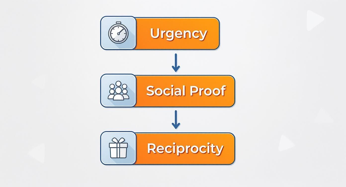
As you can see, the most effective CTAs often tap into powerful triggers like urgency, social proof, and reciprocity to get people to act.
Direct Sales and Sign-Up CTAs
Okay, so when someone is ready to pull the trigger, you need a CTA that seals the deal. These are your most direct, no-nonsense prompts, designed to move a user from just thinking about it to actually converting. There’s no ambiguity here—the goal is a purchase, a trial, or an account creation.
You'll usually find these CTAs on product pages, pricing tables, or dedicated landing pages where you know the user's intent is high. The language needs to be clear, confident, and laser-focused on that immediate next step.
Here are a few classics:
- "Add to Cart": The universal command for e-commerce. Can't go wrong.
- "Start Your Free Trial": A fantastic low-risk way for people to experience a service.
- "Create Your Account": Essential for any platform that needs user registration.
- "Buy Now": A high-urgency nudge for an immediate purchase.
Engagement and Discovery CTAs
Not every click has to end in a sale or a sign-up. Sometimes, you just want to deepen the connection, encourage people to explore, or build a bit of community. These lower-commitment CTAs are perfect for keeping users on your site longer and building a stronger brand relationship.
For instance, asking readers to share an article helps you tap into the power of social proof. A simple "Learn More" button invites curious visitors to dive deeper into your product's features without feeling pressured. These small steps are crucial for nurturing relationships with people who aren't quite ready to buy yet. By choosing the right CTA for the right moment, you create a journey that feels natural and, most importantly, effective.
Comparing Common CTA Types and Their Uses
To make it even clearer, let's break down how these different CTA types stack up against each other. Each one has a specific job to do, and knowing which to use when is half the battle.
| CTA Type | Primary Goal | Common Placement | Example Wording |
|---|---|---|---|
| Lead Generation | Capture contact info | Blog posts, landing pages, pop-ups | "Download the E-book," "Join the Waitlist" |
| Direct Sales | Drive a purchase | Product pages, pricing pages | "Add to Cart," "Buy Now," "Get Started" |
| Sign-Up/Trial | Onboard new users | Homepage, feature pages | "Start Your Free Trial," "Create Account" |
| Engagement | Encourage interaction | Blog posts, social media | "Read More," "Share This Post," "Leave a Comment" |
| Discovery | Guide user exploration | Homepage, feature pages | "Learn More," "See How It Works," "Explore Features" |
As you can see, the goal dictates the language and placement. Matching the right CTA to the user's mindset at that specific moment is what separates a click from a bounce.
Best Practices for Writing and Designing CTAs

Alright, so you know what a CTA is and which type to use. That's the first step. Now for the fun part: making CTAs people actually want to click. Getting this right is a balancing act, a perfect blend of sharp copywriting and smart design.
Think of your CTA as the final handshake. It’s what seals the deal. But if your words are weak or your design is invisible, your visitor will walk away without a second thought. Both elements have to work in sync to give your audience a clear, irresistible next step.
Crafting Compelling CTA Copy
The words you choose for your call to action are everything. Let's be honest, generic phrases like "Submit" or "Click Here" are boring. They’re vague and uninspired. Your real goal is to use language that’s packed with action and value, telling people exactly what they’re getting.
The best CTA copy always kicks off with a strong, commanding verb. Think words like "Get," "Start," "Join," or "Discover"—they’re direct and they get people moving. Then, pair that verb with a clear benefit. You have to answer the reader's unspoken question: "What's in it for me?"
A powerful call to action doesn't just tell people what to do; it tells them why they should want to do it. Shifting from "Submit" to "Get My Free Marketing Plan" transforms a generic command into a compelling offer of value.
For example, instead of a button that just says "Download," try something like "Download Your Free E-book." See the difference? That simple tweak shifts the focus to the user and the value they're about to receive. This kind of clarity removes hesitation and makes the decision to click a no-brainer. And it's not just about the button text; mastering how to write ad copy that converts is a crucial piece of the puzzle.
Don't just take my word for it—the data backs this up. CTAs using action verbs like "Buy" or "Subscribe" can lift conversion rates by around 122%. And just switching from a plain link to a button design can boost conversions by 45%. Buttons are just more intuitive.
Designing for Maximum Impact
Your CTA's design is just as critical as its copy. If someone can't find your call to action, they can't click it. Simple as that. The main goal here is to make your CTA stand out from everything else on the page, but without being obnoxious.
Three design principles will get you there:
- Color and Contrast: Your CTA button needs to pop. Use a color that contrasts with the page's background and the elements around it. This creates a visual pull that draws the user's eye right where you want it.
- Size and Shape: The button has to be big enough to be easily seen and clicked, especially on a phone. You don't want it to be so huge it takes over the page, but it needs to look like a button and be easy to tap.
- White Space: Don't underestimate the power of empty space. Giving your CTA room to breathe is critical. Plenty of white space keeps it from getting lost in the clutter and makes it a clear, focused target.
When you nail the design, you guide the user’s attention, making your desired action the most obvious next step. Pair that with great writing, and you’ve created a seamless path to conversion. If you want to go deeper on writing that gets results, check out our guide on how to write ad copy that really works.
Where to Place Your Calls to Action for the Best Results
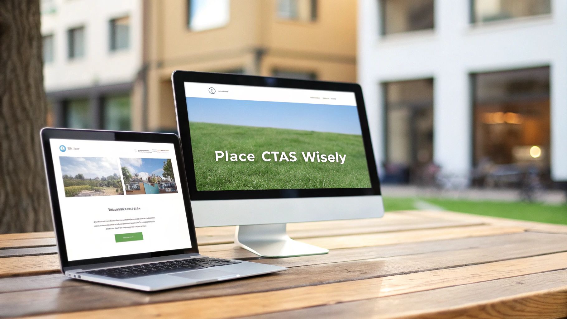
An incredible call to action is completely useless if no one ever sees it. The secret to a high-performing CTA isn't just what it says, but where it lives. Smart placement ensures your prompt appears at the exact moment a user is most ready to take that next step.
Think of your website as a conversation. You wouldn't ask for the sale the second someone walks in the door, right? In the same way, you have to place CTAs in spots that match the user's mindset, guiding them naturally from one point to the next.
Getting this right is a game-changer for attracting inbound leads and customers. It turns your content from a simple information hub into a powerful conversion tool.
Match the Placement to the User’s Intent
Different pages on your site serve different purposes, and your CTA has to reflect that. A visitor on your homepage is just exploring, while someone on a product page is seriously evaluating. Your CTA placement needs to respect that context.
Here are the most common and effective spots to place a CTA:
Above the Fold: This is the prime real estate a user sees without scrolling. It’s the perfect spot for your main, high-level CTA, like "Start Your Free Trial" or "Explore Our Services."
End of a Blog Post: After someone has just finished reading your awesome content, their engagement is peaking. This is the ideal moment for a lead-gen CTA like "Download Your Free Guide," especially if it relates to the article's topic.
Within Emails: Email CTAs should be singular and crystal clear. Whether it’s "Shop the Sale" or "Read the Full Story," the goal is to drive traffic back to a specific, relevant page. Keep it simple.
On Landing Pages: A dedicated landing page should have one goal and one CTA. Period. This focused environment strips away all distractions, making it the best place for high-commitment actions like "Buy Now" or "Request a Demo."
The right call to action in the wrong place is just noise. The key is to anticipate the user’s next logical question and present your CTA as the clear, helpful answer.
What About Secondary and Floating CTAs?
While a primary CTA is essential, you can also sprinkle in secondary CTAs for different goals. For example, a sticky bar that stays at the top of the page can feature a newsletter sign-up without getting in the way of the main content.
A well-timed pop-up can also be super effective, especially when it's triggered by specific behavior, like when a user is about to leave the page.
Ultimately, by understanding the user's journey, you can place your calls to action at those critical decision-making moments. That’s how you dramatically increase their visibility and impact.
Measuring and Optimizing Your CTA Performance
Crafting a killer call to action is a great start, but it's not the end of the road. The real growth kicks in when you stop guessing what works and start using data to find out for sure. Measuring your CTA’s performance is how you turn a good button into a great one.
Think of it like a scientist in a lab. You start with a hypothesis—maybe something like, "A green button will get more clicks"—and then you test it. This simple process pulls you out of the world of opinions and lets you make decisions based on what your audience actually does, not just what you think looks good.
Key Metrics to Track
To figure out if your CTA is hitting the mark, you only need to keep an eye on two main metrics. These numbers paint a clear picture of what’s working and what needs a tune-up.
- Click-Through Rate (CTR): This is the percentage of people who see your CTA and actually click it. A high CTR means you’ve successfully grabbed their attention and made them want to act.
- Conversion Rate: This metric takes it a step further. It measures the percentage of people who click the CTA and complete the action you wanted, like making a purchase or filling out a form.
Focusing here is crucial. Marketing data reveals that landing pages with a single, powerful CTA convert at an average rate of 13.5%. That's a good deal higher than the 10.5% average for pages that have multiple CTAs, which just shows how much a clear, optimized prompt matters. For more on this, you can check out these fascinating conversion rates across industries.
A/B testing is your secret weapon. By methodically testing one variable at a time—the color, the text, the placement—you can uncover the specific changes that lead to measurable improvements in clicks and conversions.
This data-first approach is the bedrock for turning your CTAs into reliable conversion machines. If you're ready to go deeper, our guide on conversion rate optimization tips is packed with more advanced strategies. By consistently measuring and refining, you move from guesswork to a predictable system for growth.
Got Questions About Calls to Action?
Once you get the hang of what a CTA is, a few practical questions almost always pop up. It's one thing to know the theory, but another to put it into practice. Let's tackle some of the most common ones I hear.
How Many CTAs Should I Have on One Page?
This is a great question. For a dedicated landing page, stick to one. A single, focused CTA almost always performs best because it keeps the user's attention on the single most important action.
On longer pages, like a blog post, it's fine to have a primary CTA at the end and maybe a secondary one (like a newsletter signup) tucked into the text. The key is to avoid "decision paralysis." Don't give people so many competing options that they end up choosing none of them.
What’s the Difference Between a CTA and a Value Proposition?
Think of it like this: your value proposition is the "why." It explains the awesome benefit someone gets from your offer. The CTA is the "how." It tells them exactly what to do to get that benefit.
A truly great call to action weaves the value proposition right into the text. "Submit" is a weak, lifeless CTA. But "Get Your Free Marketing Guide" is a powerhouse because it screams value.
Can a Call to Action Just Be Text?
Technically, yes. A CTA can be a simple hyperlink. But all the data points in one direction: button CTAs convert better. A lot better.
Buttons are visually impossible to miss and are universally understood as clickable. It’s best to save simple text links for secondary, less critical actions where a big button might feel like overkill.
Ready to transform your AI-generated text into natural, human-like content? Natural Write helps you refine your drafts, bypass AI detection, and produce high-quality writing with a single click. Start humanizing your content for free at https://naturalwrite.com.