In today's competitive digital landscape, attracting traffic is only half the battle. The real challenge, and where the most significant opportunity lies, is in converting those visitors into customers, subscribers, or leads. This is the core of Conversion Rate Optimization (CRO), a systematic process for increasing the percentage of users who complete a desired action on your website.
CRO isn't about guesswork or chasing fleeting trends; it's a data-driven discipline that blends user psychology, design principles, and rigorous analytical testing. A higher conversion rate means more value from your existing traffic, leading to better ROI on marketing spend and sustainable business growth. This comprehensive guide moves beyond generic advice to provide a tactical playbook. We will explore 8 proven conversion rate optimization tips, each designed to deliver measurable results.
Inside this listicle, you’ll find actionable steps, real-world examples, and recommended tools to implement powerful strategies. From A/B testing and CTA design to leveraging social proof and optimizing mobile experiences, these techniques will help you enhance user engagement and significantly boost your bottom line. If you're looking for expert assistance to unlock your website's full potential, consider exploring professional Conversion Rate Optimization services for a tailored approach. For everyone else, let's dive into the strategies that transform clicks into conversions and traffic into tangible growth.
1. A/B Testing and Multivariate Testing
A/B testing, also known as split testing, is a foundational method in conversion rate optimization. It involves comparing two versions of a webpage, email, or other asset to see which one performs better. By showing variant A to one segment of your audience and variant B to another, you can gather empirical data on which version drives more conversions.
Multivariate testing expands on this by testing multiple variables simultaneously. This approach helps you understand how different elements, like a headline and a call-to-action (CTA) button, interact with each other. While more complex, it can reveal powerful combination effects that A/B testing might miss.
Why This Method is Crucial
Guesswork is the enemy of optimization. A/B testing replaces assumptions with data, allowing you to make informed decisions that directly impact your bottom line. It provides a systematic way to improve user experience, increase engagement, and ultimately, boost your conversion rate. This methodical approach is one of the most reliable conversion rate optimization tips because it validates changes before you commit to them site-wide.
How to Implement A/B Testing Effectively
To get started, focus on high-impact elements where a change is most likely to produce a significant result.
- Start with a Hypothesis: Don't test random ideas. Formulate a clear hypothesis, such as "Changing the CTA button text from 'Submit' to 'Get My Free Quote' will increase form submissions because it is more specific and value-oriented."
- Test One Variable at a Time: In a standard A/B test, isolate a single change, like the headline, an image, or button color. This ensures you can attribute any performance difference directly to that specific change.
- Ensure Statistical Significance: Use a sample size calculator to determine how many visitors you need for your results to be statistically significant. Stopping a test too early can lead to false conclusions based on random chance.
- Document Everything: Keep a detailed log of all tests, including your hypothesis, the variants, the duration, and the results. This creates an invaluable library of insights for future optimization efforts.
The following bar chart visualizes the dramatic conversion lifts achieved by notable A/B testing campaigns.
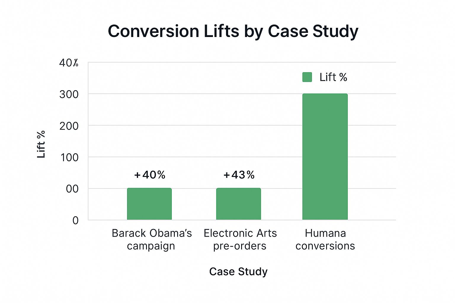
As the chart shows, even established organizations like Barack Obama's 2008 campaign saw a 40% lift from testing simple elements, while Humana's staggering 433% increase demonstrates the transformative potential of optimizing just a single call-to-action.
2. Improve Page Load Speed and Performance
Page load speed refers to the time it takes for a webpage's content to fully display after a user clicks a link. In the world of conversion rate optimization, speed isn't just a technical metric; it's a critical component of the user experience. Modern users expect near-instantaneous results, and even a one-second delay can lead to frustration, increased bounce rates, and lost conversions.
Optimizing performance is a direct path to holding a visitor's attention. When a page loads quickly, users are more likely to stay, engage with your content, and move down the conversion funnel. Major companies have proven the direct correlation between speed and revenue. For example, Walmart discovered that for every one-second improvement in page load time, conversions increased by a significant 2%.
Why This Method is Crucial
A slow website is one of the fastest ways to lose a potential customer. It creates a poor first impression and signals a lack of professionalism or care. Improving your site's performance directly impacts key business metrics, including user satisfaction, search engine rankings, and ultimately, your conversion rate. This is one of the most fundamental conversion rate optimization tips because a fast site ensures your audience actually sees the brilliantly crafted content and offers you've prepared for them.
How to Implement Performance Optimization Effectively
Improving page speed involves a multi-faceted approach, targeting different aspects of how your site delivers content to the user's browser.
- Benchmark and Diagnose: Start by using a tool like Google PageSpeed Insights to analyze your current performance. It will provide a score and a list of specific, actionable recommendations to address bottlenecks on your site.
- Compress and Optimize Images: Large, unoptimized images are often the biggest cause of slow load times. Compress all images before uploading them, and use modern formats like WebP which offer high quality at smaller file sizes.
- Leverage Caching and a CDN: Enable browser caching so that repeat visitors don't have to re-download all your site's assets. For a global audience, use a Content Delivery Network (CDN) to store copies of your site on servers closer to your users, drastically reducing load times.
- Minimize Code and Scripts: Clean up your site by minifying HTML, CSS, and JavaScript files to reduce their size. Additionally, remove any unnecessary plugins or third-party scripts that add extra load time without providing significant value to the user experience.
3. Optimize Call-to-Action (CTA) Design and Placement
A Call-to-Action (CTA) is a prompt on a website that tells the user what to do next. It can be a button, link, or image designed to get an immediate response, such as "Buy Now," "Sign Up," or "Download Your Guide." Optimizing your CTA involves strategic placement, compelling copy, and a design that grabs attention and motivates users to click.
Because the CTA is often the final gateway to conversion, its effectiveness is paramount. Even minor adjustments to its text, color, or position can have a significant impact on your conversion rates, making it one of the most high-leverage elements to focus on in your optimization efforts.

Why This Method is Crucial
Your CTA is the bridge between a user's interest and the desired action. A weak or poorly placed CTA creates friction, confusion, and hesitation, causing potential customers to abandon the page. A well-optimized CTA, however, provides a clear, compelling path forward, reducing decision fatigue and guiding users seamlessly through the conversion funnel. This is one of the most fundamental conversion rate optimization tips because it directly addresses the final decision-making moment.
How to Implement CTA Optimization Effectively
Effective CTA optimization is a blend of psychology, design, and copywriting. Start by analyzing your most critical CTAs and forming hypotheses for improvement.
- Use Action-Oriented, First-Person Copy: Instead of "Start your trial," test "Start my trial." ContentVerve saw a 90% increase in clicks by making this simple shift from second-person to first-person language.
- Create Visual Contrast: Your CTA button should stand out from the rest of the page. Use a color that contrasts with your site’s background but still aligns with your brand. Performable famously increased conversions by 21% just by changing their button color from green to red.
- Strategic Placement and Spacing: Position your primary CTA "above the fold" so users see it without scrolling. Use ample white space around the button to eliminate distractions and draw the user's eye directly to it.
- Communicate Value: Reinforce what the user gets by clicking. Instead of a generic "Submit," try a value-driven phrase like "Get My Free Quote" or "Download the Ebook Instantly."
4. Leverage Social Proof and Trust Signals
Social proof is the psychological concept where people conform to the actions of others under the assumption that those actions reflect the correct behavior. In digital marketing, this translates to using signals like customer reviews, testimonials, case studies, and endorsements to build credibility. By showing that other people trust and value your product or service, you reduce friction and anxiety for new visitors, making them more likely to convert.
Trust signals, such as security badges and partner logos, work in tandem with social proof. They provide visual cues that assure users their data is safe and that your business is legitimate and well-regarded within its industry. This combination is a powerful tool in any CRO arsenal, effectively borrowing credibility to build your own.

Why This Method is Crucial
In an anonymous digital world, trust is a valuable currency. New visitors arrive at your site with inherent skepticism, and it's your job to overcome it. Social proof acts as a shortcut to building that trust, validating your claims through the unbiased voices of existing customers. It’s one of the most effective conversion rate optimization tips because it addresses a fundamental human need for validation before making a decision, especially for high-value purchases.
How to Implement Social Proof Effectively
Integrating social proof requires a strategic approach. It's not just about collecting testimonials; it's about placing them where they will have the most impact.
- Place Proof at Decision Points: Add customer testimonials or review ratings near key decision points, such as on your pricing page or directly within the checkout process. This reassures users at the exact moment they might feel hesitant.
- Be Specific and Authentic: Vague praise like "Great service!" is less impactful than a detailed testimonial that addresses a common pain point. Use real names, photos, and company titles to enhance credibility. For example, Crazy Egg saw a 64% conversion lift by adding specific customer testimonials to its homepage.
- Showcase Volume and Authority: Numbers are persuasive. Phrases like "Join 50,000+ satisfied customers" or displaying logos of well-known clients (like Basecamp did to increase enterprise sign-ups by 28%) create a powerful impression of popularity and authority.
- Use Trust Badges Strategically: Display security seals (like SSL certificates) and payment provider logos near forms where users enter sensitive information. This small addition can significantly reduce cart abandonment.
To maximize the impact of your social proof, it's vital to tailor it to your target audience. You can learn more about how to understand your audience's motivations on naturalwrite.com to select the most resonant testimonials and trust signals.
5. Simplify Forms and Reduce Friction
Every form field you ask a user to fill out is a potential point of friction, a small hurdle that can cause them to abandon the process. Form optimization is the art of removing these hurdles by eliminating unnecessary fields, simplifying steps, and making the entire conversion process as effortless as possible. The core principle is straightforward: fewer barriers lead to more conversions.

This method goes beyond just forms, encompassing any part of the user journey where effort is required. Reducing friction means streamlining navigation, removing distractions, and providing clear instructions so that the path to conversion is smooth and intuitive. A user who doesn't have to think or struggle is a user more likely to convert.
Why This Method is Crucial
In a digital world where attention spans are short, friction is the enemy of conversion. High-friction experiences lead to frustration and high bounce rates, while low-friction experiences feel seamless and respectful of the user's time. By simplifying forms, you directly address one of the most common reasons for cart abandonment and lead generation drop-off.
The impact can be monumental. Expedia famously increased its annual profit by $12 million simply by removing one optional field ("Company Name") from its checkout form. This single change demonstrates how even minor friction can have a massive financial impact, making this one of the most potent conversion rate optimization tips you can implement.
How to Implement Form Simplification Effectively
Your goal is to make completing a form feel like an easy, natural step, not a chore. Here's how to get started:
- Be Ruthless with Fields: Ask only for the information you absolutely need for the immediate next step. For example, Dropbox's initial signup requires only an email and password, collecting more data later.
- Improve Form Layout: Use a single-column layout, which is easier for users to scan and complete. Group related fields together under logical headings (e.g., "Shipping Information") to reduce cognitive load.
- Provide Real-Time Feedback: Use inline validation to show users success or error messages as they fill out each field, rather than waiting until they hit "submit."
- Eliminate Forced Account Creation: Allow guest checkout for e-commerce stores. Forcing users to create an account before a purchase is a major conversion killer.
- Show Progress: For multi-step forms, use a progress bar to show users where they are in the process and how much is left. This manages expectations and encourages completion.
6. Create Compelling, Benefit-Focused Copy
Conversion copywriting is the art and science of writing persuasive text that prompts users to take a specific action. Unlike general content, its sole purpose is to convert. This is achieved by focusing on the customer's needs, motivations, and pain points, rather than simply listing a product's features. It’s about communicating clear value and guiding the user toward a conversion goal.
Great conversion copy frames your offer in terms of benefits, answering the user's ultimate question: "What's in it for me?" It bridges the gap between what your product is and what it does for the customer, transforming features into tangible outcomes and solutions. This messaging is concise, user-centric, and strategically designed to overcome objections before they even arise.
Why This Method is Crucial
Your website's copy is your 24/7 salesperson. If it’s unclear, uninspiring, or focused on the wrong things, potential customers will leave without a second thought. Benefit-focused copy is one of the most powerful conversion rate optimization tips because it speaks directly to user psychology. It builds an emotional connection, establishes trust, and makes your value proposition instantly understandable, compelling visitors to act.
How to Implement Compelling Copy Effectively
To transform your copy from a simple description into a conversion machine, you must shift your perspective from what you sell to what your customer gains.
- Lead with Benefits, Support with Features: Start with the outcome. Instead of "Our software has a 128-bit encryption feature," write "Keep your data completely secure and private." The feature (encryption) supports the benefit (security).
- Address the Reader Directly: Use "you" and "your" to make the conversation personal. This creates a direct connection and shows the reader that you understand their specific needs.
- Use Specificity and Data: Vague promises are forgettable. Instead of "Increase your sales," use "Boost your sales by up to 30%." Numbers add credibility and help users visualize the potential impact.
- Overcome Key Objections: Identify the top 2-3 reasons someone might hesitate to convert (e.g., price, complexity, trust) and address them directly in your copy. For instance, you can add a money-back guarantee or social proof.
By implementing these copywriting principles, you can create messaging that resonates deeply with your audience. For a more detailed guide, you can learn more about how to write compelling content.
7. Implement Exit-Intent Popups and Retargeting
Exit-intent technology is a powerful tool designed to give you a second chance with visitors who are about to leave your site. It works by tracking mouse movements and velocity, detecting the precise moment a user is about to navigate away or close the tab. At that critical point, it triggers a targeted popup with a special offer, a newsletter signup, or a helpful message.
This last-ditch effort interrupts the user's exit pattern and re-engages them with a compelling reason to stay. When combined with retargeting, which involves showing targeted ads to people who have already visited your site, you create a comprehensive strategy to recapture potentially lost conversions. This dual approach is one of the most effective conversion rate optimization tips for recovering abandoning traffic.
Why This Method is Crucial
Not every visitor is ready to convert on their first visit. By implementing exit-intent popups, you can capture leads that would otherwise be lost forever. Instead of passively letting visitors leave, you actively intervene to address potential objections or offer an irresistible incentive. For example, WPMU DEV successfully captured over 12,000 leads in just six months using this technique. This transforms a potential bounce into a valuable email subscriber or even an immediate sale.
How to Implement Exit-Intent Popups Effectively
A successful exit-intent strategy is about providing the right value at the right time, not just interrupting the user.
- Offer Genuine Value: Don't just ask for an email. Provide a tangible benefit, such as a 15% discount, a free ebook, or a valuable case study. The offer must feel like a fair exchange for their attention.
- Segment Your Offers: Tailor your popup message to the page the user is leaving. If they are abandoning a product page, offer a discount on that specific item. If they are leaving a blog post, invite them to subscribe for more content on that topic.
- Control the User Experience: Avoid annoying visitors. Use frequency caps to ensure the same person doesn't see the popup on every visit. Make the 'close' button easy to find and click.
- Test and Refine: Continuously A/B test your exit-intent offers. Experiment with different headlines, copy, designs, and calls-to-action to see what resonates most with your audience and drives the highest number of conversions.
8. Optimize for Mobile Experience
Mobile experience optimization is the process of ensuring that every part of your website and conversion funnel is seamless and effective for users on smartphones and tablets. With mobile traffic now eclipsing desktop for most industries, this goes far beyond basic responsive design. It involves creating a dedicated user journey with thumb-friendly interfaces, simplified navigation, and conversion paths tailored for smaller screens and on-the-go contexts.
This approach acknowledges that mobile users behave differently. They have shorter attention spans, different interaction patterns (tapping vs. clicking), and often face slower network connections. A truly optimized mobile experience accounts for these factors to remove friction and guide users toward conversion.
Why This Method is Crucial
Ignoring the mobile experience is no longer an option; it's a direct path to lost revenue. A clunky, slow, or difficult-to-navigate mobile site frustrates users, leading to high bounce rates and abandoned carts. A well-executed mobile strategy, on the other hand, can dramatically increase engagement and conversions. For example, after AliExpress optimized its mobile checkout process, it saw a staggering 104% increase in conversions. This proves that a dedicated focus on mobile is one of the most impactful conversion rate optimization tips you can implement.
How to Implement Mobile Optimization Effectively
To build a high-converting mobile experience, you need to think "mobile-first" from the ground up.
- Design for Thumbs: Position key elements, especially call-to-action (CTA) buttons, within easy reach of a user's thumb. Make buttons large enough to be tapped easily without accidental clicks on adjacent elements.
- Simplify Navigation: Replace complex desktop menus with mobile-friendly alternatives like a "hamburger" menu or a bottom navigation bar. The goal is to help users find what they need with the fewest taps possible.
- Prioritize Performance: Mobile users are impatient. Compress images, minify code, and leverage browser caching to ensure your site loads quickly, even on slower 3G connections. Test your site's performance using tools that simulate mobile network conditions.
- Streamline Forms and Checkout: Minimize the amount of typing required. Use mobile-native features like autofill, and offer one-click payment options like Apple Pay or Google Pay to make transactions frictionless. A simple form on mobile can make or break your conversion rate.
Conversion Rate Optimization Strategies Comparison
| Item | Implementation Complexity 🔄 | Resource Requirements ⚡ | Expected Outcomes 📊 | Ideal Use Cases 💡 | Key Advantages ⭐ |
|---|---|---|---|---|---|
| A/B Testing and Multivariate Testing | Medium to High (requires tools and traffic volume) | Moderate (specialized software, analytics integration) | Reliable data-driven improvements, ROI measurement | Websites, emails, marketing assets with sufficient traffic | Eliminates guesswork, clear conversion impact |
| Improve Page Load Speed and Performance | High (technical expertise, infrastructure needed) | High (developer time, infrastructure investment) | Faster load times, reduced bounce rates, SEO boost | All websites desiring better UX and SEO ranking | Direct impact on UX, SEO, and conversions |
| Optimize Call-to-Action (CTA) Design and Placement | Low to Medium (design & copy adjustments) | Low (mainly design and copywriting effort) | Increased click-through and conversion rates | Any conversion point needing clear user direction | Immediate conversion impact, low cost |
| Leverage Social Proof and Trust Signals | Low to Medium (content gathering and placement) | Low to Moderate (content creation & management) | Increased trust, reduced purchase anxiety | New brands, high-value purchases, unknown audiences | Builds credibility fast, reduces perceived risk |
| Simplify Forms and Reduce Friction | Medium (design and backend changes) | Moderate (development and UX testing) | Lower abandonment, faster form completion | Signup, checkout, lead capture forms | Dramatically reduces friction, improves mobile rates |
| Create Compelling, Benefit-Focused Copy | Medium (requires strong copywriting and testing) | Low to Moderate (copywriting resources) | Higher engagement and conversions | All conversion-focused marketing content | Emotional connection, competitor differentiation |
| Implement Exit-Intent Popups and Retargeting | Medium (behavior tracking and integration) | Moderate (tools and ongoing optimization) | Recover lost visitors, grow email lists | E-commerce, subscription, and lead sites | Last-chance engagement, strong ROI |
| Optimize for Mobile Experience | High (requires specialized design and development) | High (device testing, development resources) | Improved mobile conversions and user satisfaction | Any site with significant mobile traffic | Captures majority traffic, SEO benefits |
Start Optimizing Today for a More Profitable Tomorrow
The journey through the world of conversion rate optimization can feel complex, but it boils down to a fundamental principle: continuous, incremental improvement driven by user data. We have explored eight powerful strategies, moving from the technical foundations of site speed and mobile experience to the psychological nuances of persuasive copy and social proof. These aren't just isolated tactics; they are interconnected components of a holistic system designed to create a smoother, more intuitive, and more compelling user journey.
Think of your website not as a static brochure but as a dynamic, evolving conversation with your audience. Each of the conversion rate optimization tips discussed provides a new way to listen and respond. A/B testing is how you ask your users, "Do you prefer this or that?" Optimizing your CTAs is how you make your invitations clearer. Simplifying forms is how you remove unnecessary obstacles from their path. Every change, no matter how small, is an opportunity to learn what your audience truly values.
Synthesizing the Core Principles for Maximum Impact
The true power of conversion rate optimization is unlocked when these strategies are combined. A lightning-fast website is fantastic, but its impact is multiplied when it also features benefit-focused copy and strategically placed trust signals. A perfectly designed mobile experience will only convert if the forms within it are simple and friction-free.
To begin integrating these concepts effectively, focus on these key takeaways:
- Embrace a Test-and-Learn Culture: Stop guessing and start measuring. The most successful optimizers are those who treat every change as an experiment. Form a hypothesis based on user data (e.g., from analytics or heatmaps), implement a controlled test, and let the results guide your next steps.
- Prioritize the User Experience (UX): Every tip, from page speed to compelling copy, is fundamentally about improving the user's experience. A frustrated, confused, or impatient visitor will not convert. View your optimization efforts through the lens of your customer: Is this easy? Is this clear? Does this solve my problem?
- Clarity and Simplicity Win: In a world of digital noise, clarity is a superpower. This applies to your value proposition, your CTA buttons, your navigation, and your checkout process. Ruthlessly eliminate jargon, reduce unnecessary steps, and make the desired action the most obvious and simple choice for the user.
- Build Trust at Every Touchpoint: Trust is the currency of the digital economy. Every testimonial, security badge, clear privacy policy, and well-written product description contributes to your "trust bank." Without it, even the most aggressive optimization tactics will fail.
Your Action Plan: Moving from Knowledge to Implementation
Reading about conversion rate optimization tips is the first step, but action is what drives results. Don't feel overwhelmed by the need to implement everything at once. Instead, adopt a methodical approach.
- Conduct a CRO Audit: Start by analyzing your current performance. Use tools like Google Analytics to identify your pages with the highest traffic but the lowest conversion rates. These are your prime opportunities.
- Identify the "Low-Hanging Fruit": Is your page load speed lagging? Are your forms unnecessarily long? Is your primary CTA buried below the fold? Tackle the most obvious problems first for quick wins that can build momentum.
- Formulate Your First Hypothesis: Based on your audit, create a specific, testable hypothesis. For example: "By changing our generic 'Submit' CTA button to a more benefit-oriented 'Get Your Free Quote Now', we believe we can increase form submissions by 15% because it clarifies the value for the user."
- Execute and Measure: Run your A/B test. Let it gather enough data to be statistically significant. Whether your hypothesis is proven or disproven, you have gained a valuable insight into your audience's behavior.
- Iterate and Expand: Apply your learnings and move on to the next test. This continuous loop of hypothesizing, testing, and iterating is the engine of sustainable growth.
By consistently applying this framework, you transform your website from a simple digital presence into a powerful, efficient engine for business growth. You create a virtuous cycle where a better user experience leads to higher conversions, which in turn provides more resources and data to further improve that experience. This is how you build not just a more profitable tomorrow, but a more resilient and customer-centric business for the long term.
Crafting compelling, benefit-focused copy is central to any successful CRO strategy, but ensuring it sounds authentic and human can be a challenge. Natural Write helps you polish and refine your text, transforming robotic AI drafts or convoluted sentences into clear, persuasive content that truly connects with your audience. Elevate your value propositions, CTAs, and product descriptions by visiting Natural Write today.